
This is a class project in Communication Design 2 class taught by Guillaume Wolf at ArtCenter College of Design. I’m asked to combine two contrasting ideas and make it work in one concept. I chose Marina Abramović as the featuring artist and childhood as the second idea. Check out how I showcase both ideas in my design. If you don’t want to read, you can also watch my presentation on YouTube.
The vibrant pink color is used throughout the book. It stands out and attracts the audience’s attention. The first half of the book is featuring Marina Abramović and the second half is about childhood memory and fun events.

I used the same elements in my posters and added music that flows with the movement. The poster is made by a combination of photography, scanned textures, and digital effects. I made the music using the app SynthOne.

After I finished the magazine, I directed and filmed a short video to capture the vibe of my magazine. It’s about a few kids accidentally discovering the entrance to the imaginary world where they meet angels from fairy tales.

Finally, it comes to the part I felt the most challenging which was designing two AR filters using Spark AR studio. I have never used this software before and I found it difficult to learn even though I watched some tutorials online. I didn’t know how to code and found it struggling. Later, I realized I didn’t need to do fancy coding and animation to achieve cool effects. I’m happy with my filters because they’re creative and simple.
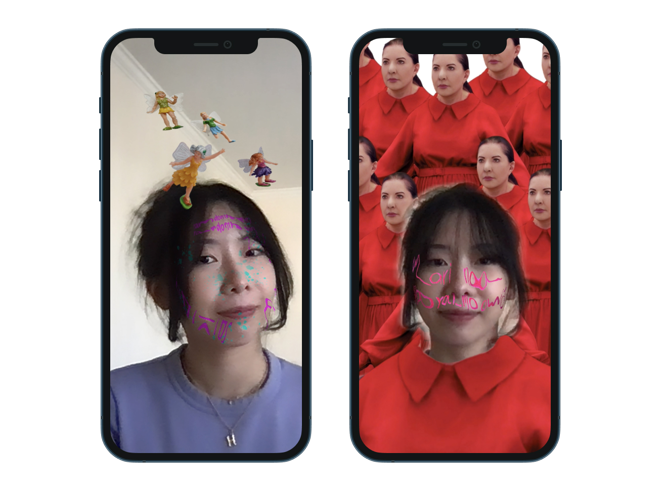
Prior to researching her, I only knew about her love story with Ulay and the performance “The Artist is Present.” I found out many interesting projects she has done through my research. For example, she likes to use her body as the medium to communicate her thoughts and create a strong emotional connection with her audience. She demonstrates high tolerance of pain, exhaustion, and fear, which I really admire. I see the power from her, I appreciate her bravery, persistence, and calmness. She accomplished things that most of us can’t do and challenges the norm.
I chose childhood as my contrasting idea because I care about early childhood education and want to discover the impacts of toys on children. I used a color-reveal barbie, playdoh, and some figures to create an imaginary world for children that brings them joy.

In the first two weeks, I came up with three different directions and discovered the one that worked the best. I not only consider margin, text size, font choices, colors, but also image treatments, paper texture, and dynamic elements.


I love my project so much and I’ve explored various new methods and media through this project. I learned to mix two art styles, work with both static and motion graphics, and push the original work to the next level. Working with Playdoh is really fun because it’s not only a toy for young kids but also a form of art for everyone. Start discovering little objects in your house and build something! Thank you for listening! I hope you enjoyed and find it inspiring.
For the final of this project, I made a presentation sharing my beginning-to-end process and learnings from this project on YouTube. If you are interested, check it out!